Time series analysis can be very effective in visualizing change of phenomenon over a period of time. In this tutorial we will be using maritime piracy incident data creating a heat map and visualizing it in time series with world shapefile data as a basemap.
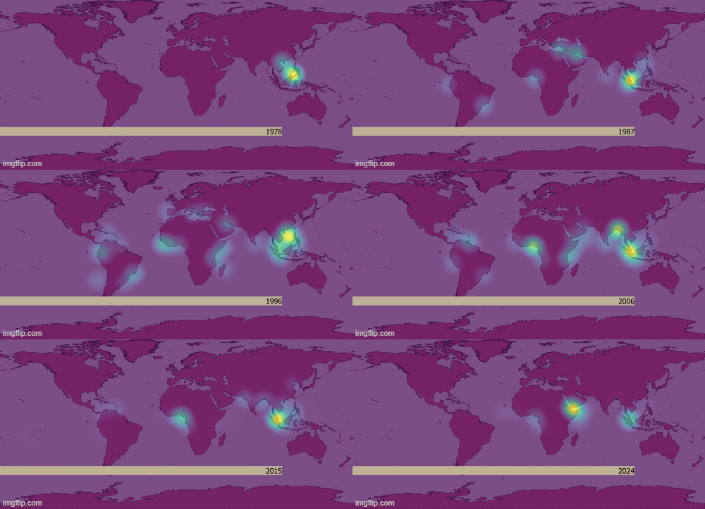
At the end of the tutorial following the below steps you can easily make a gif/video something like below.
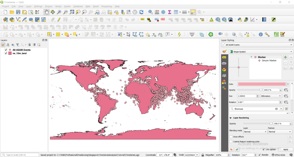
Step1: Download all above data then load them in QGIS interface as shown below.
Step 2: Creating heat map and adjusting settings.
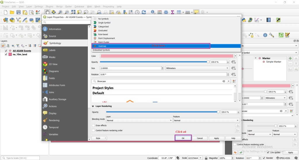
Double left click All ASAM Events layers -> Symbology -> Single Symbol
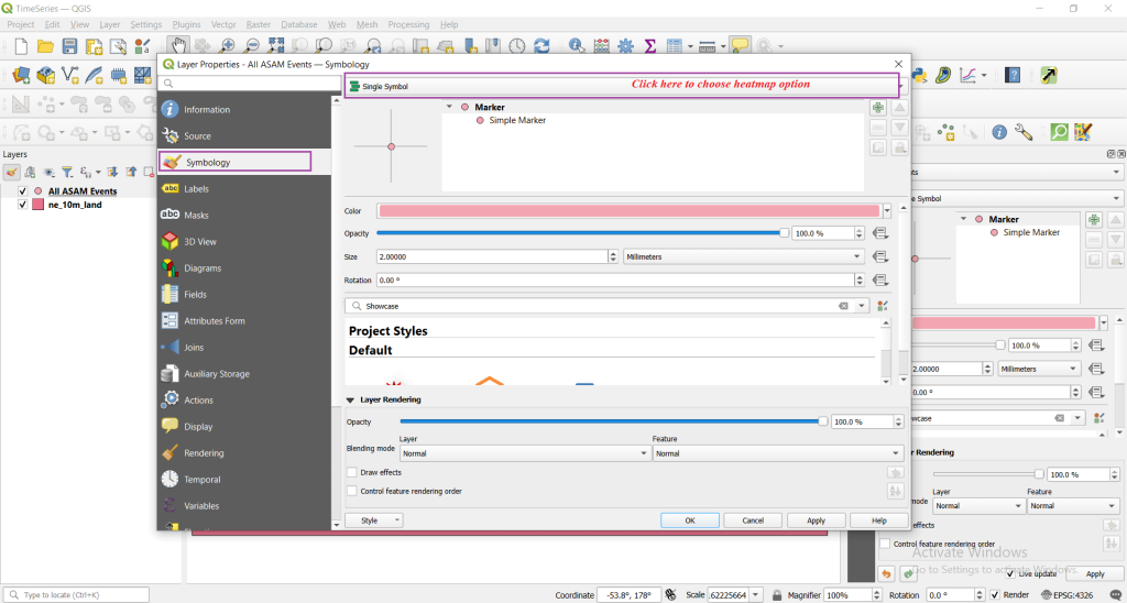
After this, choose heat map option and click ok as shown below.
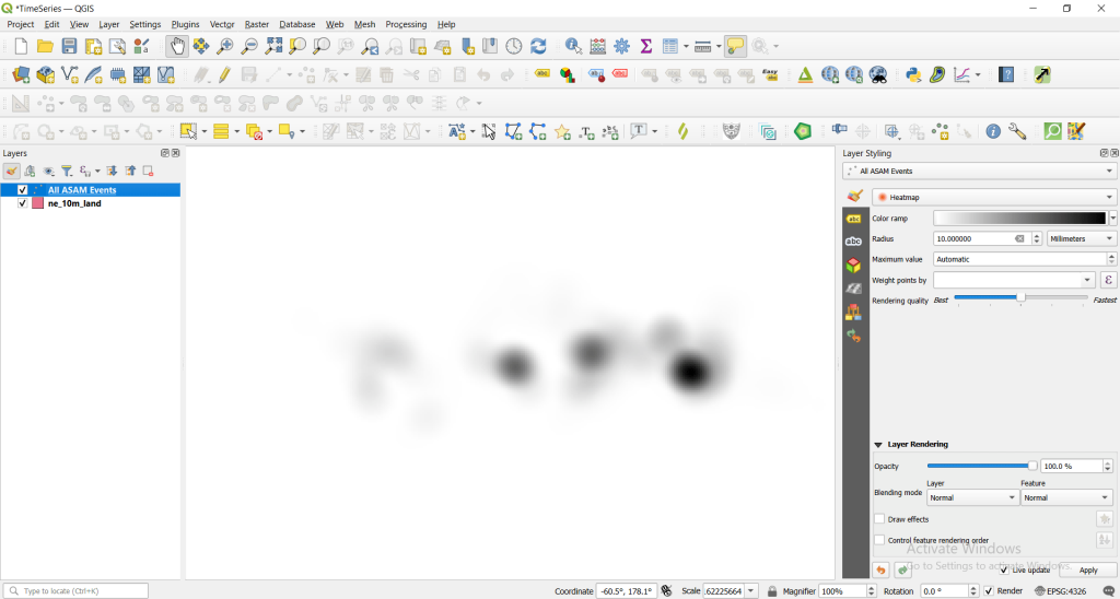
By default, you will be seeing black and white like below color visualization.
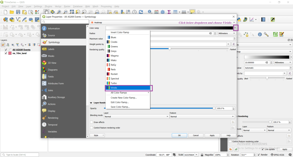
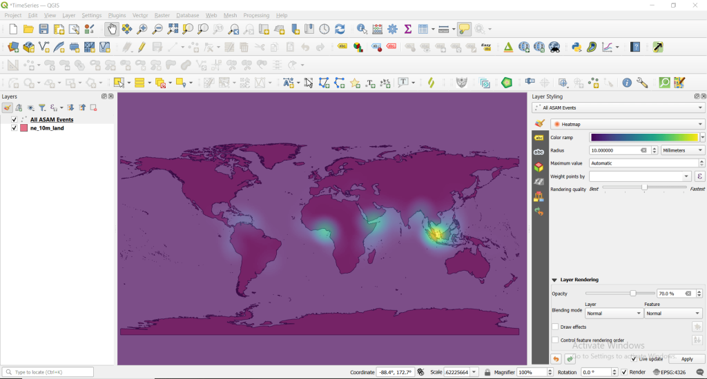
Now we will be changing above color visualization and opacity for better visualization.
Choose below opacity level to 70% and click on apply and ok.
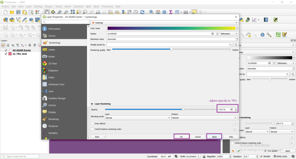
Finally, you will see below picture.
Step 3: Adjusting temporal setting.
Double left click ‘All ASAM Events’ layer -> Temporal and follow the steps as shown in below image.
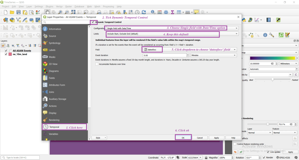
On adjusting temporal settings you layer changes with a small clock icon.
Step 4: Visualization the data with animation
Now click on Temporal Controller Panel present on top central part of the menu.
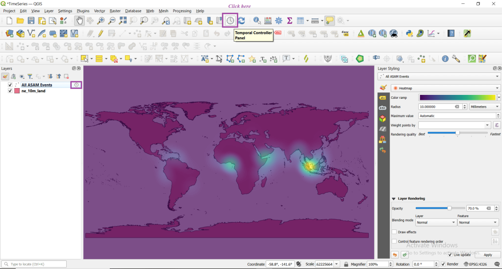
You will see something like the below one.

Now click on fixed range temporal navigation.
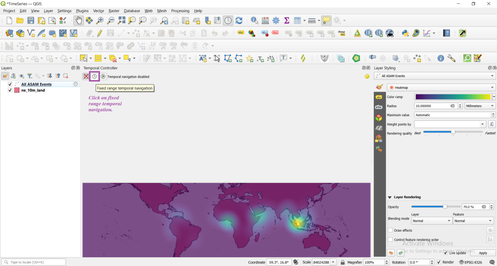
If all is well you will see the below.

Now we need to reset the date to visualize through the full range of date of data.

Now you can see the data with full range as below.
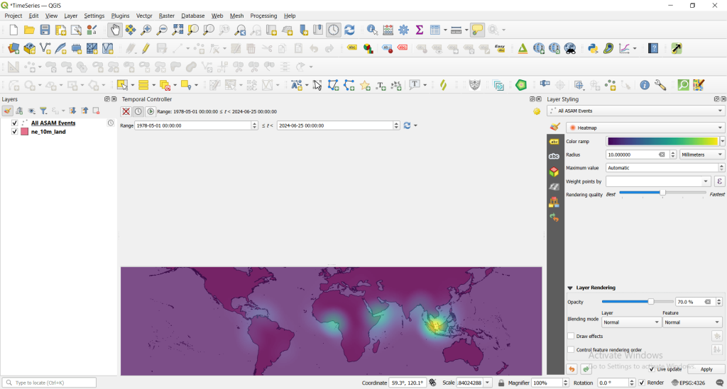
Now click on animated temporal navigation icon to visualize the data.
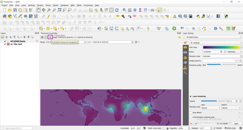
You will see something like below.
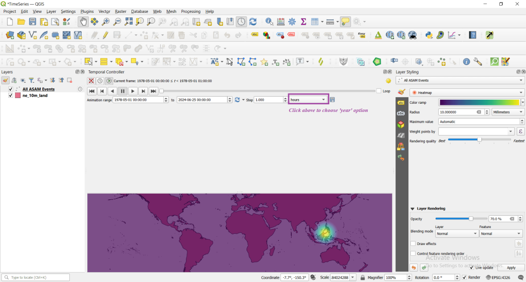
Now choose the years option and run the animation play.
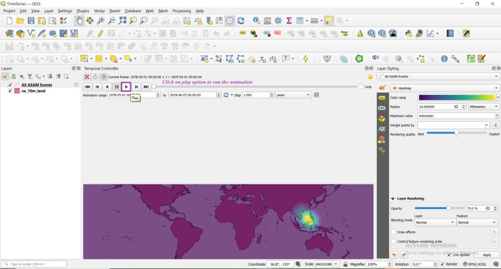
Step 5: Improving the visualization.
We can also keep the date of the incident and visualize with better fonts. Let’s go for it.
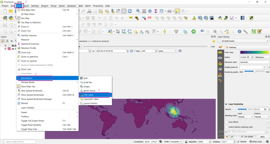
Go to view -> decoration -> title label as shown below.
If everything is fine, you will see something like below.
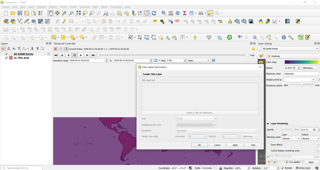
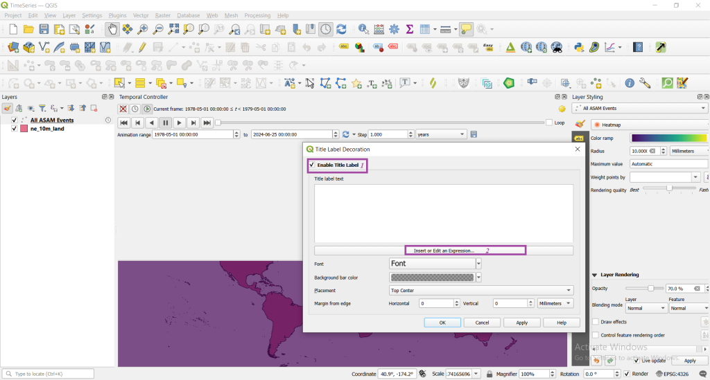
Now tick to enable the title label and click on insert or edit an expression.
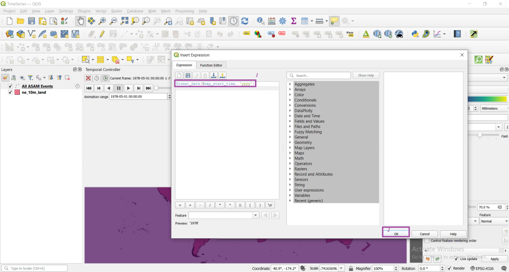
Type the following format_date(@map_start_time, ‘yyyy’) in edit expression and click ok.
Also edit the font, background, placement then click on apply and ok.
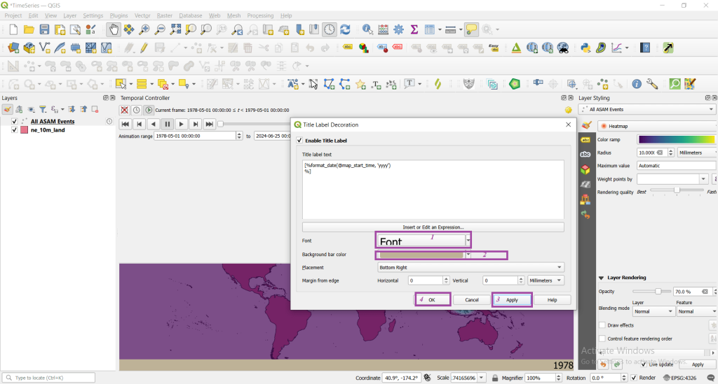
Note: You can easily adjust the visualized slide screen by dragging the screen as per the necessity.
Step 6: Exporting the animation
Animation can also be exported in form of images. For this click on save as shown in below image.
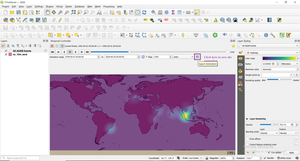
Now save the ouput images in a folder directory keeping ne_10m_land layer as layer extent -> Step as years and finally save
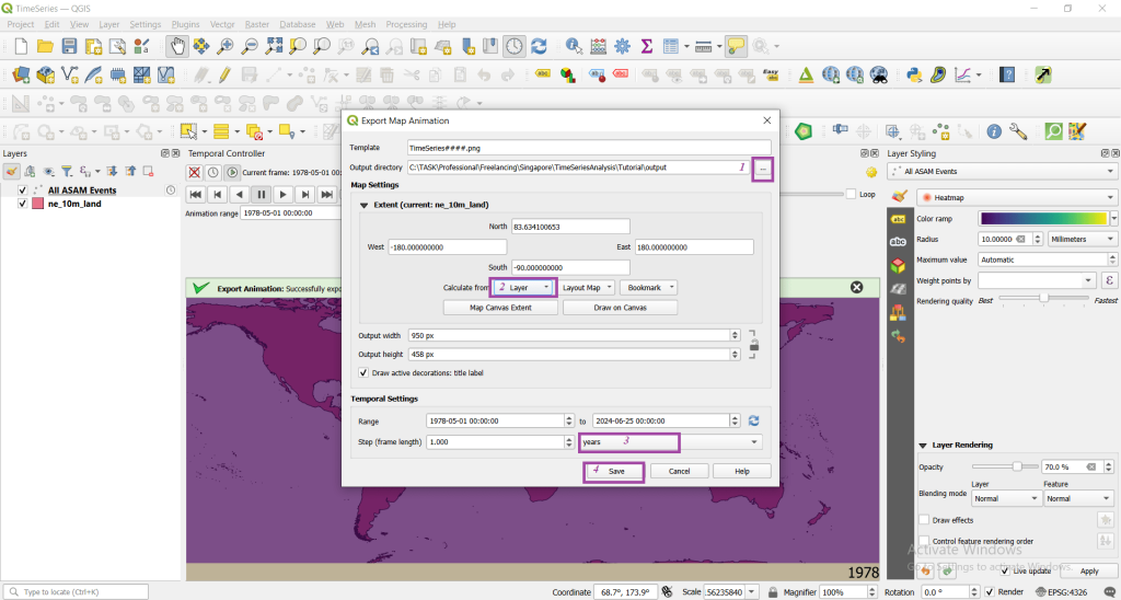
You will now get all the images in the directory you have saved and then can use any online tool to make a gif or a video maker online tool to easily visualize the data.
References:
https://www.qgistutorials.com/en/docs/3/animating_time_series.html


